Dynamic Color Correction, manage your color curves in Unity

When working on a game, sometimes you confront a problem for which there is no easy solution, and you need to do some research and work to build your own one. Because sharing is loving, I thought it would be nice make those solution into Store Assets. Although publishing takes patience and quite some work, I found the experience very rewarding.

Today, I want to share one of those asset that I have published in the store: Dynamic Color Correction.

As you can tell from previous post, I like quite a lot adding camera effects to my scenes. They often bring the deep and professional look that is not easily achieved with just the geometry and normal lighting.

Unity’s Standard Assets comes with a useful effect for that, called Color Correction Curves. It’s quite complete and for the most part, it does the job. But I found that the effect does not allow you to dynamically change its configuration. So, if you set some color curves for your scenes, you cannot switch to other ones, unless you perform some serious hacking of the asset.

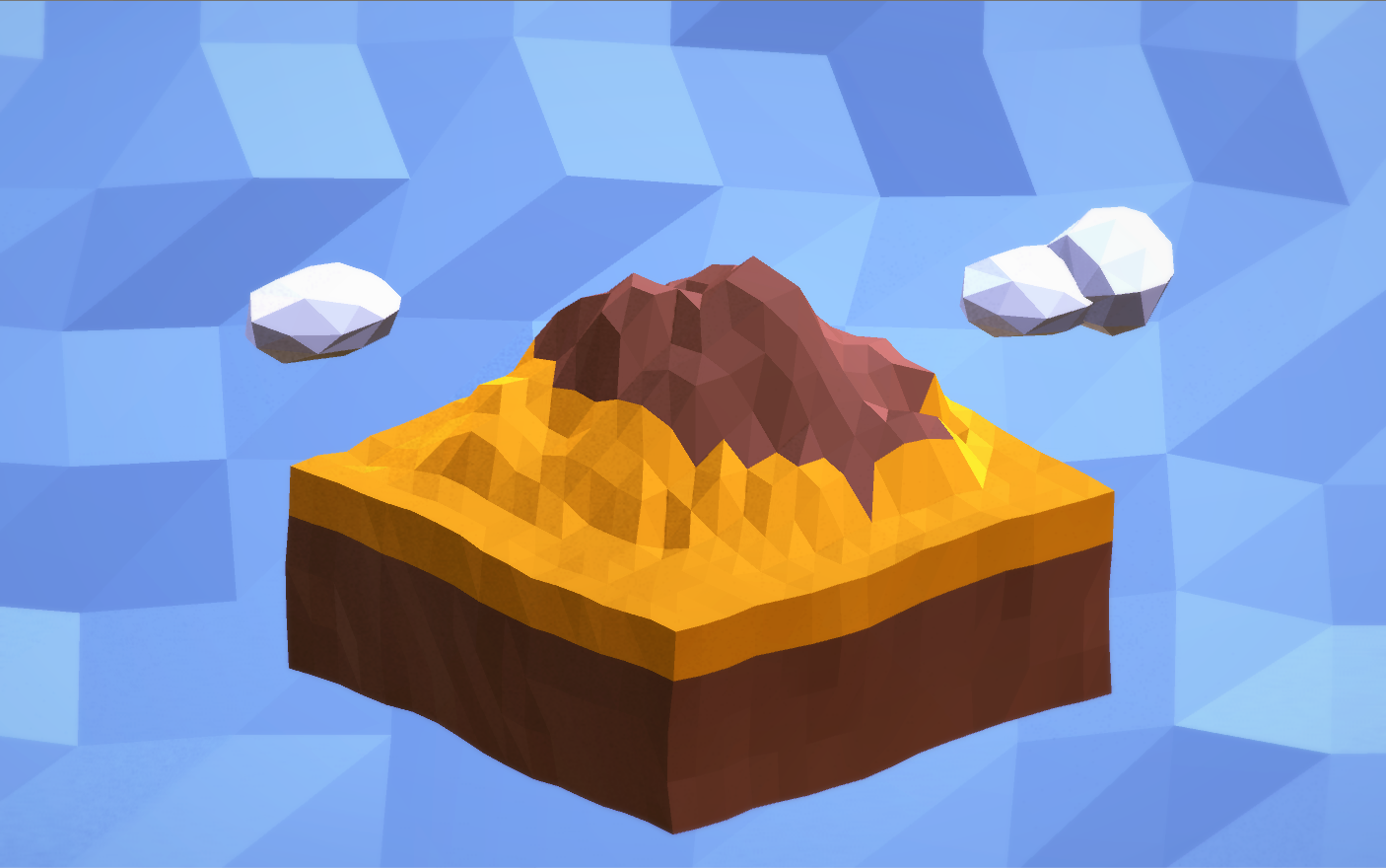
Say that you want to switch your curves from orange-ish color in the day to a bluish color in the night, like in this example (you can watch a video of this example here):

El pase de diapositivas requiere JavaScript.


Or that you need to swich from a gray color palete to a saturated one, like this nice user explains in a comment in the store page:

All I wanted to do was simply transition from a black & white world into a world full of color via scripting. I figured standard Unity would let me do this easily. I was wrong. This FREE asset lets me do just that in a VERY straightforward way. Thank you for sharing this, Corta Studios!

Asset Store Comment

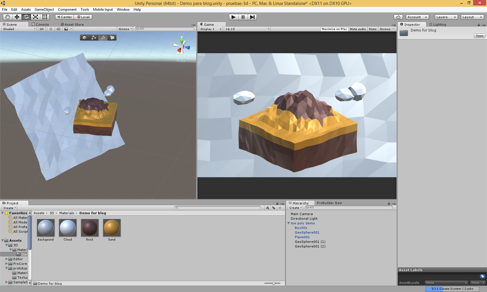
Enter our asset: Dynamic Color Correction. The asset manages Unity 5 Color Correction Curves image effect, adding more features. It’s let you define two different set of curves, visually, using the editor. Then you can interpolate between those two curves dynamically using the editor, and on runtime from your own scripts or GUI controls.
Please visit the Store page to download the asset. You can find further instructions on how to use it and more examples there. You can also play with a demo scene here, where you have a scene with two curve sets predefined (A and B) and switch from one to another with an UI.

The asset has a five stars average rate and have downloaded quite well for the past year. And, it’s free! Check it out!

Turing Adventure working again! New version just released

Some time ago the chatbot server stopped working, and Turing Adventure with it.
I have taken advantage of the situation and changed the way in which the game communicates with the server, releasing a new version. Outages like this one should not happen again in the future with this new version. If you want to play the game again, or you want to show it to someone, go ahead and download it again.

Now that I was at it, I took the opportunity to throw some love to the game. The intro is now controllable by the user and don’t jump to the game automatically.

New intro interface

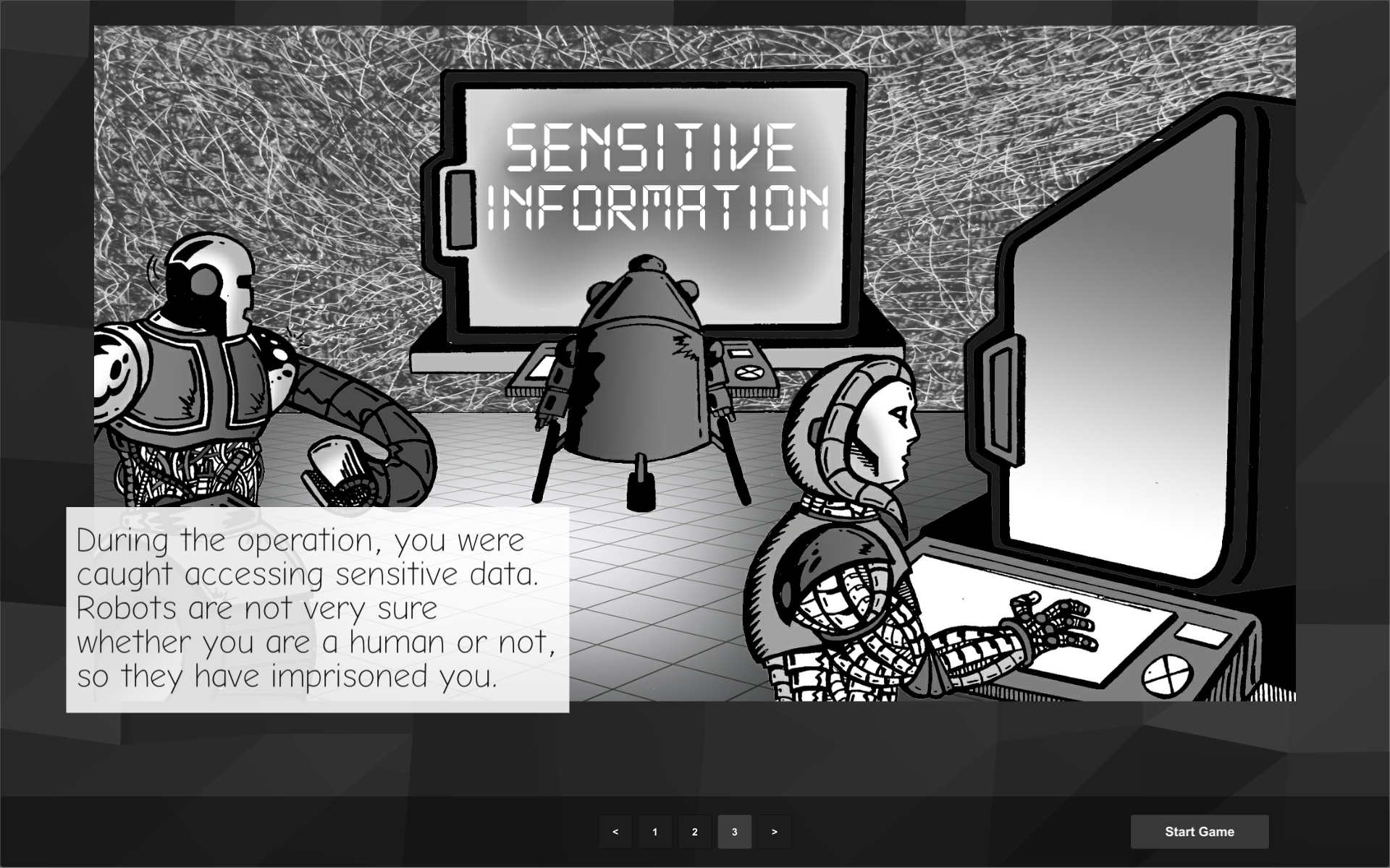
In the prison scene, I have solved some bugs, tweaked the interface and added some small features. For example, the chat bubbles now have distinctive styles and a busy animation, and; the description bubble is now visible when you are chatting with a robot. I think this will help newcomers a lot.

Busy animation

I am still working on a full featured game when I don’t have a more pressing project (I work as a freelance), but I’m not going very fast. I’m trying to figure out a more efficient way to work in the game, and coming back from time to time to the jam version to test new features is an interesting option.

You can download Turing Adventure from Game Jolt:

Implementing Turing Adventure: First steps

After months of studying and planning, I’ve started building a complete game based on Turing Adventure, the game I developed for the last Adventure Jam, that was awarded with the Colossal Leap Award.

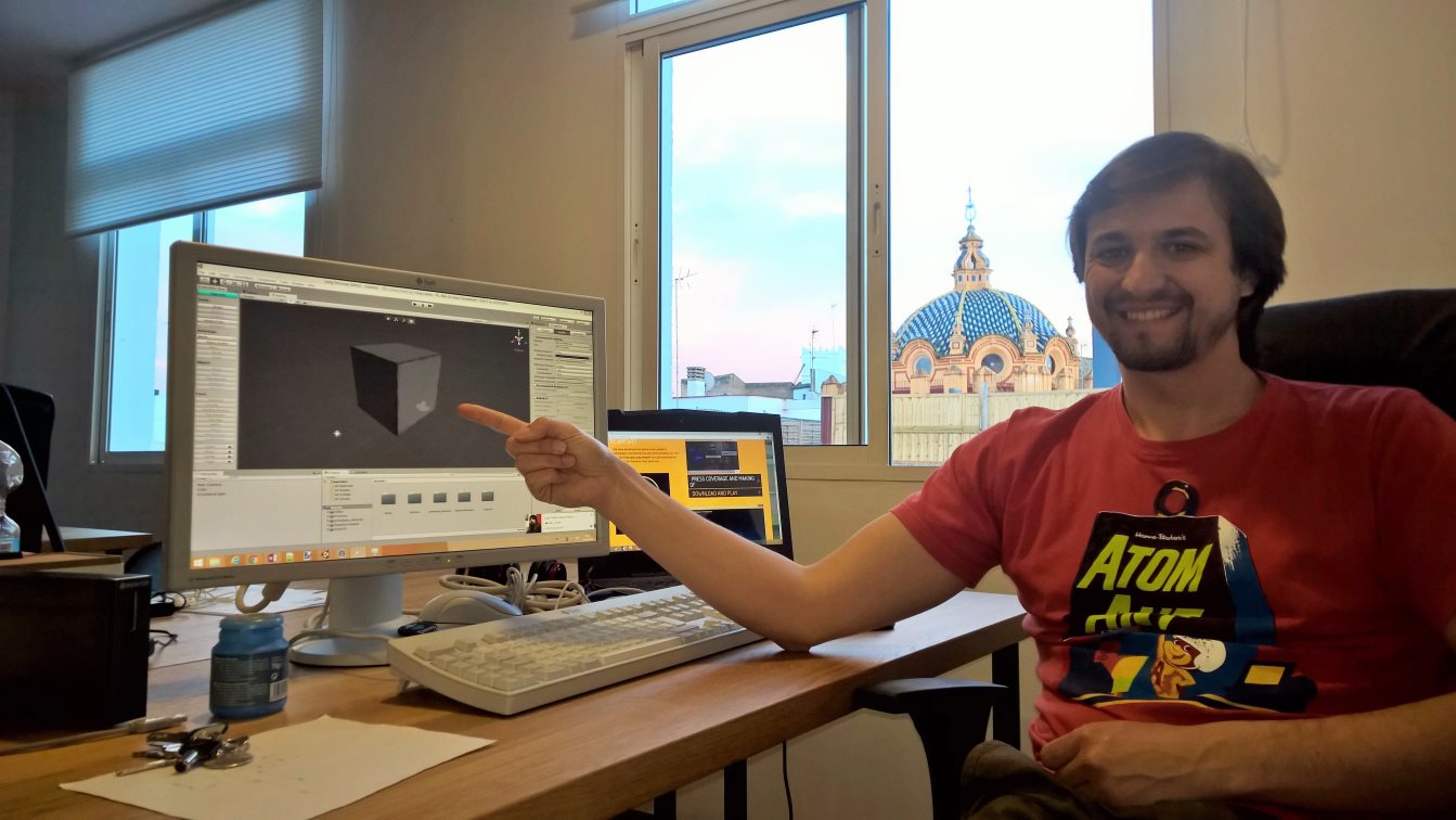
Me yesterday afer planting the first "stone" of the new Turing Adventure

Me yesterday after planting the first «stone» of the new Turing Adventure

It’s been almost a year since that, but I hope that all the preparations that I did will ease the process.

This is what I can tell so far:

It will be released episodically

There will be three episodes. The first one will have a size that I feel confident that I can finish. Hopefully it will serve as an experience builder, so I can correct mistakes that I could fall into, and enhance those features that people enjoy more. Also, I intend to invest the money that I might earn in the following episodes.

Distribution

The interface will be designed for mouse and keyboard but it will be also touch friendly. It will go to all stores that I manage to put the game into. That means the Windows Store for desktop, maybe itch.io, and mobile stores as soon as I figure out the best way to write your inputs in mobile in a nice way (maybe voice recognition). I will apply for Green Light at the same time.

It will be always on

This is something that carry certain stigma for some users, especially after the the Xbox One launch, but there are strong reasons for that:

  • First and foremost, because of some license issues related to some software I’m using, I cannot release the chatbot components with the game. But if I keep those component on a server instead of releasing it, there are no such issues.
  • I might include a voice recognition system, so you will be able to talk to the game instead of writing. All modern systems nowadays are online services.

Incidentally, this comes with others advantages:

  • In order to make the robots react better to human interaction, I need to read conversations with players (with the players’ permission). New learned behavior would be available instantly for all the players.
  • Chatbots technologies usually requires a lot of computer power. Not good for mobile platforms or low-end PC’s. Also, all reliable chatbot technologies that I know are server based.

Low poly aesthetics, hand-drawn pictures

I will try to pursue a low poly aesthetic to achieve a modern look that fits with the story. It will feature some hand drawn art to complement the story telling, although how much will depend on how much I will be able to afford.

A small kick-starter?

I don’t like this idea because of the amount of effort that it requires, that would be detracted from the game development effort. But I might need the help of some professionals to finish the game properly, and I might not be able to pay them. A small kick-starter could be a solution for that.

I’m planning the development in three stages:

First, I am building gray levels for the first episode, with some basic interaction, to show the game to friends and colleges and get the most feedback on the story as possible.

Then I will build a complete version of the game but release it as a beta, or any kind of early access. I expect robots of this version to be very stupid, despite of my best efforts, and that the game will be almost unplayable. But I hope to improve this situation in a relative short period of time, thanks to the users’ feedback and conversation logs.

After that, I will upload the first polished version of the game to the stores, where hopes will meet reality 🙂 .

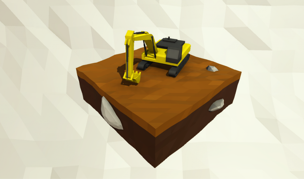
Low poly art style exploration: Excavator

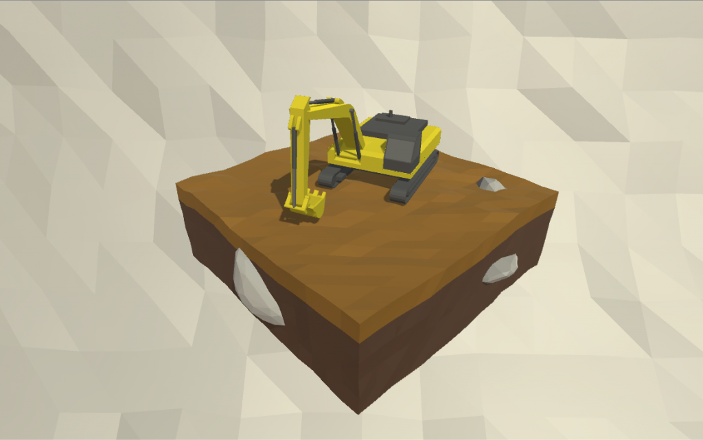
Excavator GIF

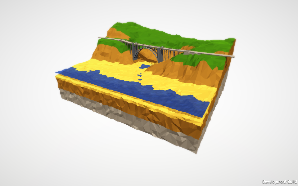
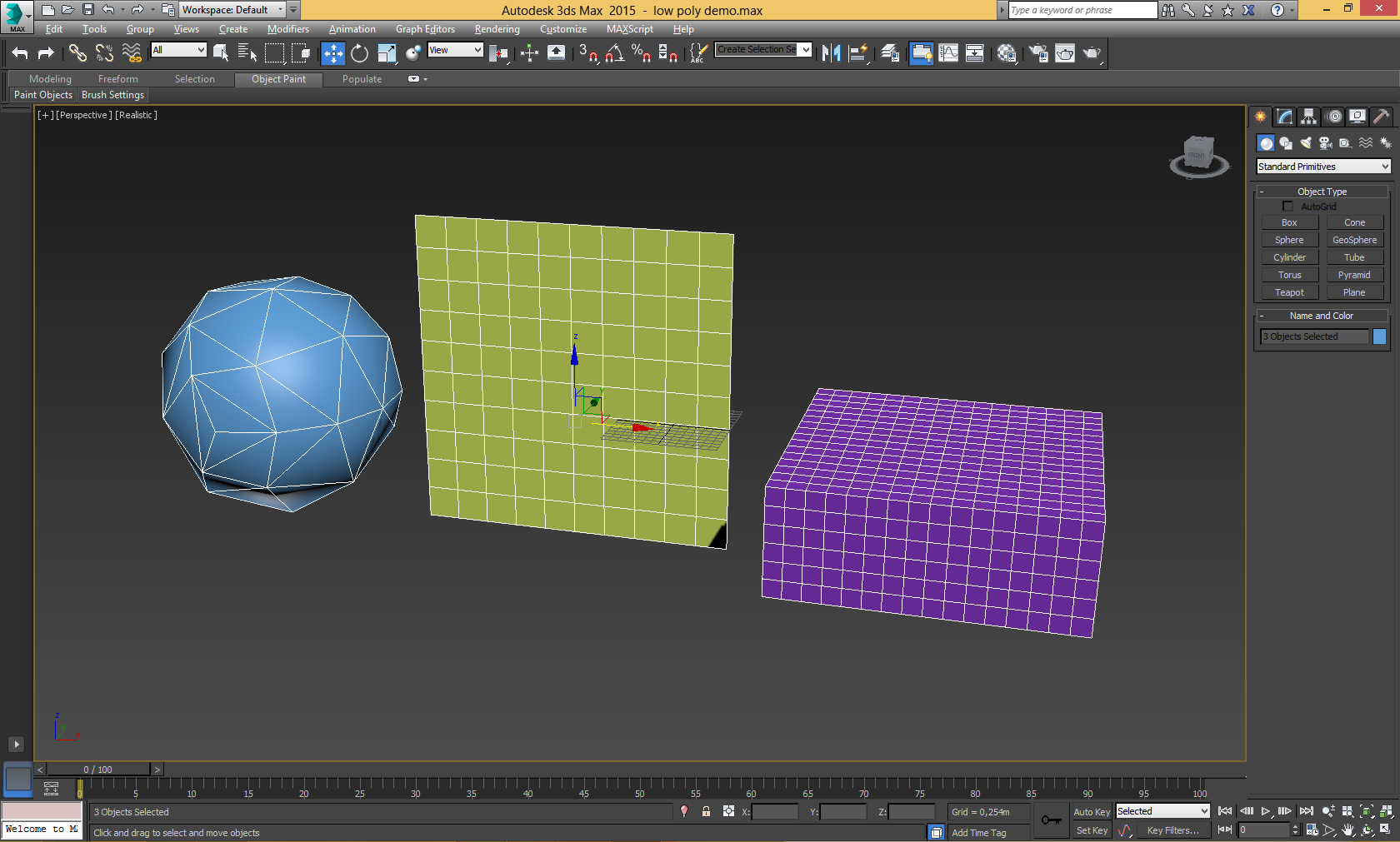
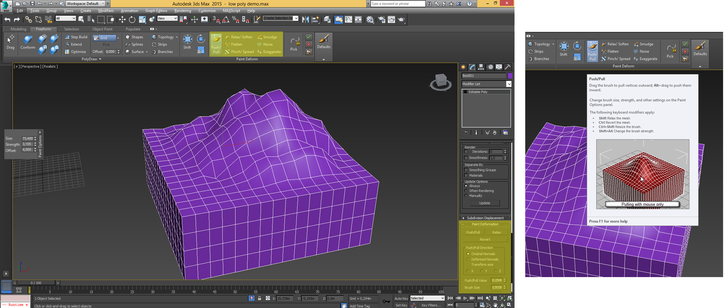
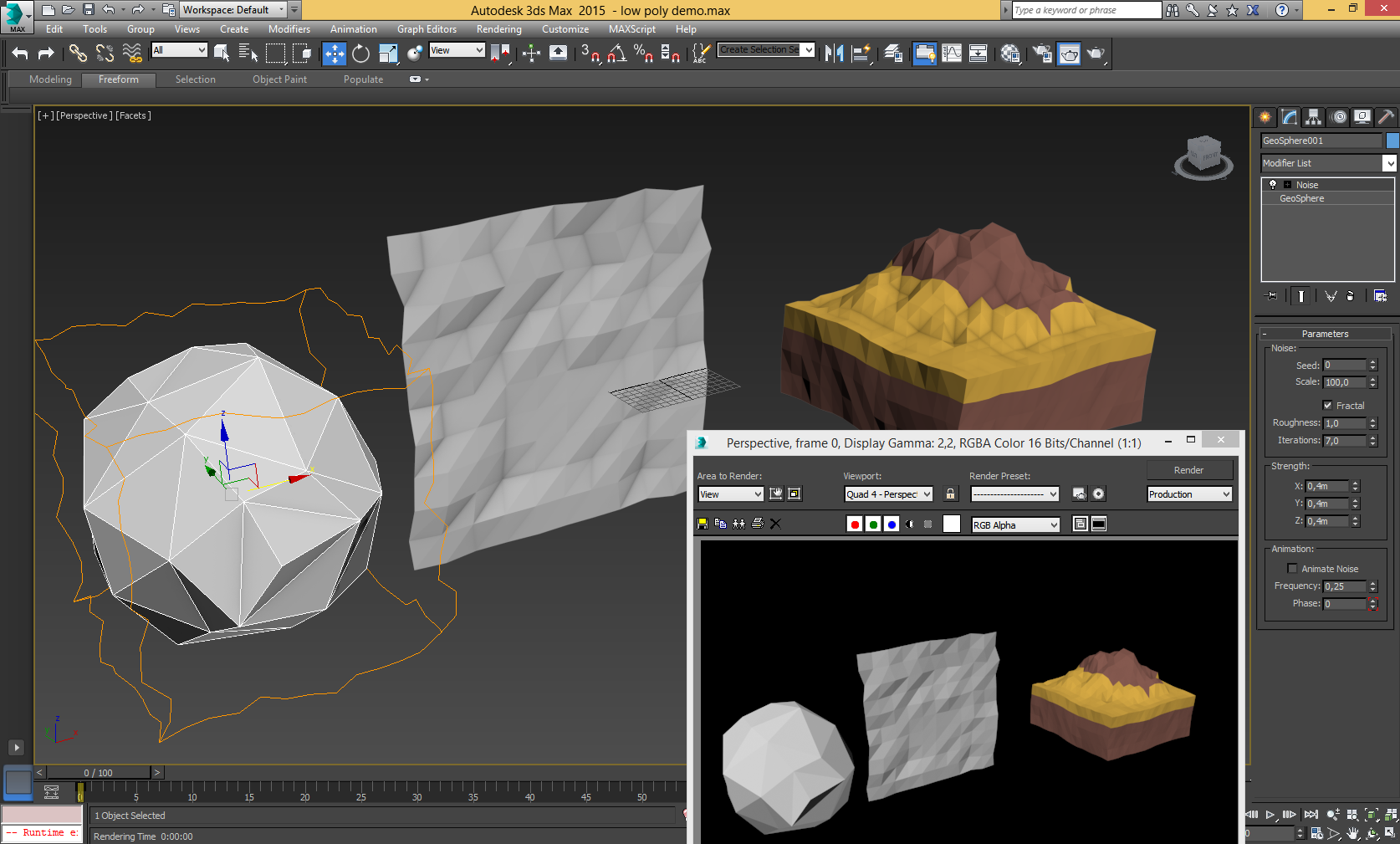
During the last few months I’ve been taking some time to learn about low poly modelling and other stuff that can help make things look more interesting in a game, like camera effects and tuning the lighting system in Unity 5.

I’ve made a couple of videos showcasing some experiments, I’ve learned some lessons, and even developed a script to manage color correction dynamically – which I uploaded to the Unity Asset Store.

I figured out that I could summarize my work in a few posts and share the results with the community. I’ve been posting most of those results in Facebook, but the blog gives me the opportunity to explain this work further.

Case of study: Excavator

I’m going to start this series of posts with a simple model of an excavator. I made it with 3DS Max using a technique (rather than a technique I would say “a way of doing things”) called box modelling. Basically, you start with simple 3d objects, and adding edges and extruding operations you can achieve complex models. Also, I like to use Boolean operations. You need to be organized and have a good special thinking, but other than that, the idea is easy to follow.

If you need some resourses, I found the tutorials at the web site Digital Tutors very useful to learn the basic techniques for box modelling with 3DS Max:

The background and the base terrain are simple shapes with some geometry filters that give that wrinkled effect to the mesh. I’ll get back to it in future posts.

Camera Filters

Camera filters are free to use in Unity 5 free Edition, and this is really good news for indie developers. Camera filters can change dramatically how a game looks, and it is worth to take the time to learn to use them and the artistic and technical theory behind them. Bellow you can see an image of the model with the lighting set up in unity before and after applying Color Correction Curves (different for the foreground and background), Screen Space Ambient Oclusion and Obscurance.

Excavator no filter

The first filter alters the mood of the scene, make it feels more live and cinematic. The the last two give more deep to the model and terrain, countering the excessive simplicity of the models while keeping a clean and elegant look.

Excavator with filters

Youtube author PigArt illustrate the importance of the filters in less than three minutes in this video: 3 nodes that can change your render (in Blender). I strongly recommend his channel for anyone interested in getting into low poly modelling.

I will talk more about filters in a future post.

Designing Turing Adventure Part Four: AIML: The technology behind Turing Adventure

This is Part Four of an ongoing series of post describing the design of Turing Adventure. You can try the game here.

Futurama, how a robot works

Technically, Turing Adventure is possible using chatbot technologies. In contrast to other complex artificial intelligence models, chatbots are based on some very simple principles that were first formulated during the ‘60s, and experienced a resurgence the end of the 90’s – beginning of the century.

They are based on pattern matching: for a certain input, the chatbot is programmed to return some predefined output. This is what is called a rule. Patter matching were the underlying mechanism of the conversational adventures that precedes the graphic adventures, where you had to type some input that matches a pattern to advance in the story. Usually the pattern to match is defined with regular expressions, so through the use of wildcards (i.e.: a symbol that matches any word), a given output could serve as a reply for several inputs. In this way, you do not need then to type exactly what the programmer wanted, nor has the programmer to predefine an endless list of possible input for each option.

Reductionism

However, with chatbots you can do something that it was impossible with conversational adventures: chat naturally. With the latter, you had limited vocabulary and grammar options, which led conversations to be similar to typing commands. This later evolved nicely to a command based graphic interface (starting the graphic adventure genre), like Lucas Arts games using scumm.

Mistery house and maniac mansion examples

Command based conversational interfaces (left: Mistery House) eventualy evolved to command based graphic interfaces (right: Maniac Mansión)

The natural chat capabilities of chatbots are achieved with a technique called reductionism. This technique consist in matching the user input, but instead of returning an answer to the user, feed it again to the system, modified. This new input should have an equivalent semantic, but it can contains less social etiquette, some orthographic corrections, or more simple grammar. In other words, the transformed input should mean the same, but be shorter, or, reduced. We are transforming a potentially complex input in a simpler-to-match one. This process is repeated until we reach the simplest sentence possible but with the same meaning of the original input given by the user.

If we have a corpus of rules that manage reductionism in the abstract, reducing inputs before treating them, we need to write answers only for those simpler ones. If the user inputs a line that is complex, or that the developer didn’t think about, it would be simplified to a line for which the developer has written an answer.

With a large enough and properly defined corpus of reduction rules, chatbots can provide answers to questions that the programmer of the chatbot had never considered.

It is impossible for the developer think in advance of anything that the user can write. It is then through reductionism how the user is able to speak naturally with the chatbot with good results.

An example

Let’s say that we are adding knowledge to our chat about what is Star Wars. When we ask it What is Star Wars?, the robot may reply: Star wars is a classical Hero’s Journey movie that stands out because of the robots that appear on it.

We can write a rule that represent this dialog line. But what about others ways of asking about Star Wars? For example, if the user says: Excuse me, can you please tell me what do you know about Star Wars? We shouldn’t need to take care of that, nor of any other way to ask about Star Wars. Reductionism should simplify the user input to what is star wars?

What follows is a series of reductions that could simplify the user input in this example (* will work here as a wildcard, matching one or more words):

Original user input: Excuse me, can you please tell me what do you know about Star Wars?

Matched pattern: Excuse me *

Starting a sentence, excuse me only has a phatic and/or courtesy function. We can discard it and feedback the rest of the sentence.

Feedback input: can you please tell me what do you know about Star Wars?

Matched pattern: Can you please *

Again, please is a particle that add no relevant semantic to this sentence. We can chop it and feedback.

Feedback input: can you tell me what do you know about Star Wars?

Matched pattern: can you tell me *

In a sentence with this structure, can you don’t really add any semantic: all of the relevant semantic is carried by tell me. So again, it can be chopped.

Feedback input: tell me what do you know about Star Wars?

Matched pattern: tell me what *

Tell me can really carry some semantic, but in this case, we can discard that, because of the what that follows, which indicates that a question is starting there. We can discard, then tell me. Again, we would not discard tell me in other inputs where it is not followed by an interrogative pronoun and some more words afterwards.

Feedback input: what do you know about Star Wars?

Matched pattern: what do you know about *

All the words in this pattern has meaning, so we cannot really discard some to simplify the question. However, there is a simpler way, with fewer words, to make the same question. So we change the sentence altogether and feed it back to the system:

Feedback input: What is Star Wars?

At this point, the rule we wrote before would match, and the chatbot would reply to the user with the programmed answer.

This can seem rather complicated, but again, we have to consider that the reduction rules has been written beforehand. We only added one rule, and the corpus of reduction rules has sequentially simplify the input to the most basic one we considered. It would work the same way about questing about other topics. It would even work with bits of information that the user teach the chatbots (some of them are able to learn new knowledge from the user – e.g.: Mitsuku).

You can try asking Alice several questions about star wars or other topics here: http://alice.pandorabots.com/

You can also try with Mitsuku. Try to teach her something, and then ask her about it in different ways: http://www.mitsuku.com/

Other techniques

Chatbots can manage default information like its name, its hobbies and so on, and use them in the conversation. That is very helpful to show off the bot personality. But they can also keep track on the context of the conversation. They can remember information that the user provides, like her name, gender and other, and they can use it in later in the conversation. This gives the user a strong feeling of being understood.

They can also answer differently to a given input depending on the topic of the conversation. If, for example, we ask the chatbot, Do you like it?, the chatbot can decide whether it may refers to, for example, ice cream, flowers, or anything else, based on previous interactions, and give a personalized answer for the first two, and a generic answer for the rest of topics.

They can also provide different answers to the same input depending on a previous answer provided by the chatbot. A nice example of that is how to react to a yes/no user input after the chatbot has make her a question.

AIML and Alice

The majority of those techniques, reductionism, context awareness and others, were proposed by doctor Richard S. Wallace from 1995 to the earlier 2000’s, when he proposed the AIML (Artificial Intelligence Mark-up Language) specification. AIML is a XML dialect aimed to the definition of chatbots (although the recursion of the reductionism can allow some backtracking programming, and can be used as a deductive engine like with Prolog). The creation of AIML and dr. Wallace’s work eventually led to the creation of the Alice Foundation, devoted to the promotion and adoption of AIML and open source based chatbots. The Alice Foundation is also responsible for the maintenance of Alice, an open source set of AIML files, with more than 90.000 rules, that conform an open source chatbot (and give its name to the Alice Foundation). Many of those 90.000 rules are designed to manage reductionism in normal English conversation. Thus, to write a new chatbot, Alice conforms a complete set of rules to start from. A new chatbot can be written starting from Alice: discarding many rules that give Alice its personality; adapting or rewriting others (like greets or conversation openings), to reflect the new chatbot personality, and then; writing new rules –that will be triggered by the user directly or through reductionism- that would make the new chatbot different to others.

When writing a chatbot

There are many technical considerations to make when writing an AIML file. Reductionism must be implemented properly to avoid infinite loops. Rules should be well though to make the best use of reductionism; and the new rules should be flexible enough to be modified in the future without many dramas. Many programming patterns and best practices apply here to write AIML rules that comply with those requirements.

However, we cannot forget that when we write a chatbot, we are kind of impersonating a character. That means that before of the technical considerations, we must design the character and write dialog lines, just as we would do when writing a video game or movie plot. The technical work should come after the art work.

In addition, the efficiency of chatbot writing is highly unpredictable; as much as humans beings are. We are dealing with people here, and not people dealing with a given computer interface, but people talking, and of any topic they choose to. Experience is a plus, but it will be impossible to anticipate all reactions, topics and way to express themselves that users will input in the chatbot. That is why testing is paramount. After you write your chatbot, you have to carefully read all the conversations that people have with it. Take notes whenever the chatbot says something that it character counterpart would not say, and fix it. You will never achieve a successful chat with 100% of the conversations, but you can aim for a 95% success rate to declare your chatbot capable and well written.

Pay when (and if) you want. Looking for a more honest monetization model

Ore vagon

Looking for a new monetization model

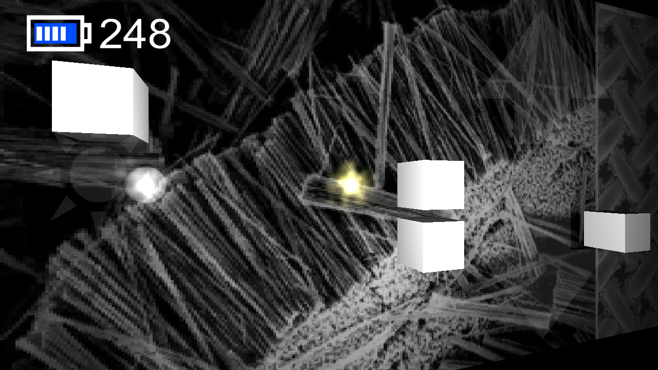
Photon Rush is our first game. It is not a large game, but its mechanic, designed to push the player out of it comfort zone, is quite tuned and is very fun. At least this is what we honestly think. We released the game on mobile and desktop platforms.

The game has been free since the beginning. We didn’t want to put ads in the game, since that would impact the experience in a negative way, and we didn’t want to spoil it. Photon Rush wouldn’t have given us much revenue through ads, anyway.

But, after the first year of the game, we decided to use Photon Rush as a test bed to try to figure out a revenue model more honest and cleaner than ads.

The gamer store option

We first retired the desktop version of the game from the web in order to try to put it in a game store. Very few people downloaded it from our web, so even a paid game on a store would have more players than a free game on our web. Being in a well know store also would increase the possibility of appearing in a bundle, and that would definitely push forward the number of players –not to say the revenues- so we decided that it was worth the try.

We were approved to appear at Desura. But then Desura apparently bankrupted, halting the process.

At that point, we had put the game with a price for the Windows Store, because it was incongruent to have to pay for the Desura’s win32 version of the game and not for the Windows Store version on Windows 8; they were basically the same. Since Photon Rush is a universal Windows 8 app, we put a price for the Windows Phone version too.

It was painful to see how, as a consequence of making the game not free, downloads halted in Windows platforms. We wanted some revenues from Photon Rush, but, above all, we wanted people to play Photon Rush!

A magical plot twist in the form of a promotion

The reason why we did not come back to the free model was that, during the process of price setting, we were contacted by myAppFree, an Italian company that each day promotes one paid app for free on Windows 8 and Windows Phone 8. MyAppFree is very popular among Windows Store and Windows Phone users.

We agreed with myAppFree to have Photon Rush featured on June 16th. It was great, in just one day, we had the same amount of downloads on the Windows platform than during all the app lifecycle in all platforms (Linux, Windows, Mac, Android, iOS, Windos Store and Windows Phone).

We were just lucky that myAppFree decided to promote our game. Photon Rush was promoted in the Windows Phone Store before, but those promotions were far less successful. After the promotion, we came back to the problem of making revenues out of Photon Rush without hurting the game or losing players. The desktop version issue was still unresolved, but we considered it dishonest to myAppFree to go back to the free model. However, the consequences of sticking with the paid model were clear: virtually zero downloads. We then decided to go something like coffee ware.

Photon Rush screen shot

Pay when (and if) you want

In this modality, the game has a price, but you can enjoy the whole game for free. From time to time, the game ask you nicely and in no intrusive way to buy the game. It states clearly that the game will stay largely the same, and that you are paying as a way of saying thanks to the devs for the game. You even receive an achievement for that!

This model has several advantages:

  • It allows playing and enjoying the game to people who has no payment options (generally people without access to a credit card, which is common in some countries, and to kids worldwide).
  • There are people who, under no circumstances, would pay for a game in a mobile device. Well, they are not going to pay, anyway, but at least they can enjoy the game, and maybe show it to other people.
  • There is no possibility whatsoever that a player feels disappointed with her purchase. She knows what she is buying.
  • As we stated before, we wouldn’t make so much money with ads with this game. But I can’t help the feeling that ads is not a nice way to earn money with ads. You are giving something nice to users (the game), while at the same time you annoy them with the ads. You are selling your user attention to ads resellers. That does not feels like a conversation between the game designer and the players.
  • Free to play model make the experience weird. Collecting and building is fun, but the cost balance in free to play games –if you don’t pay- is just not optimized for fun. Photon Rush is an aspirational game, so there is no place for that weirdness.

But, foremost, it give a feeling of purity to every penny you earn. I personally feel that the money we earned so far with Photon Rush as first money that I have really earned in my life. It’s like the player saying: Hey, here you go, grab my hard earned money. I prefer your game to that! Thanks!

Moreover, this is not just a normal goods exchange, because they already have the full game. Your players pay because they think they own it to you, or want to say thanks, or just want more of your work. And this is a very warming though.

The concept is very similar to donations, and its philosophy is very similar to that of Kickstarter or Patreon. This improves the feeling of a win-win situation, so the player will grow a bond feeling with the studio.

Technical details

The Windows Store and the Windows Phone Store have the option of downloading an app as trial. In the Windows Store, you can set up a time trial after which the app stops working (managed by the OS), or leave it timeless so the developer would implement a trial experience. In the Windows Phone store, you have only the last option. We have implemented a trial experience using the Unity 3D provided API facade, so when the user wants to buy the game, she will be redirected to the Windows Store, where she can buy the app.

Android and iOS do not have this trial experience, so we have implemented our model using an in app purchase. The process is quite more cumbersome, since there is more things to keep in mind. To simplify things, we have used an open source plugin called Soomla.

The in app purchase has one advantage over the trial approach: With the latter, every Photon Rush player who has downloaded the game before we changed the model owns the game, so they will never see the option to buy it. On the contrary, with the in app purchase approach, the whole user base will see the options once the app is updated to the new version.

Wrapping up

There are people buying the game (thanks many, people!). Not many, but they are. I am not sure yet whether this model will draw more money than ads, and how much, but I feel much more comfortable with it. I am going to use the same revenue model for the next small game I will produce.

Photon Rush logo. Download link.

Click here to download Photon Rush!

Next Steps with Turing Adventure

Caixa Bank Tower under construction in Seville

After taking some time to calmly think about this, I believe that this game concept has the potential to become a full featured game. I’m still a one man team backed by a group of friends, but I believe that I can put together a short but well-done adventure game within some months, and push it to a curated store like Steam. I am already writing that game, studying technologies that will make my job easier, and planning its execution. This will be my main job for the next months.

Read more at the Game Jolt game page news update.