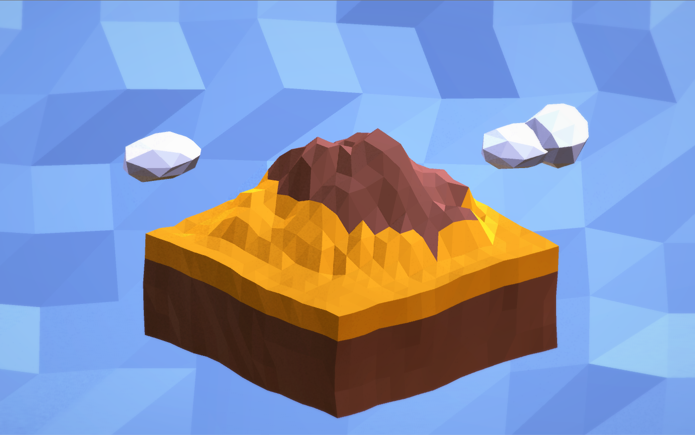
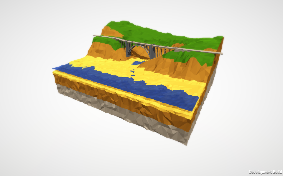
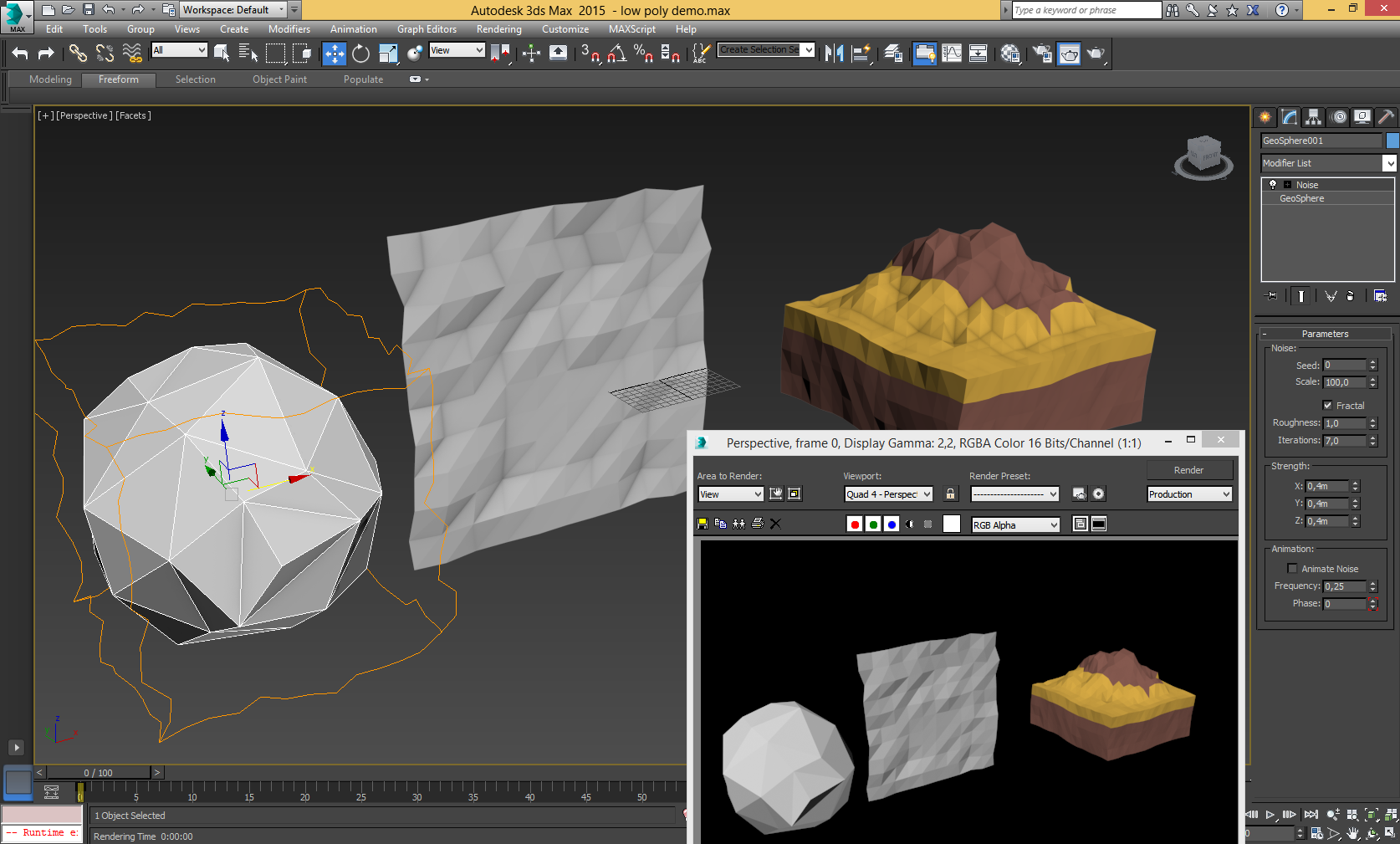
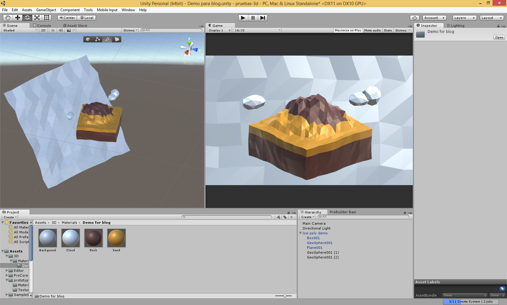
In this short tutorial I’m going to create a scene in 3DS and Unity, to show how the low poly wrinkled paper effect can be achieved in no time.
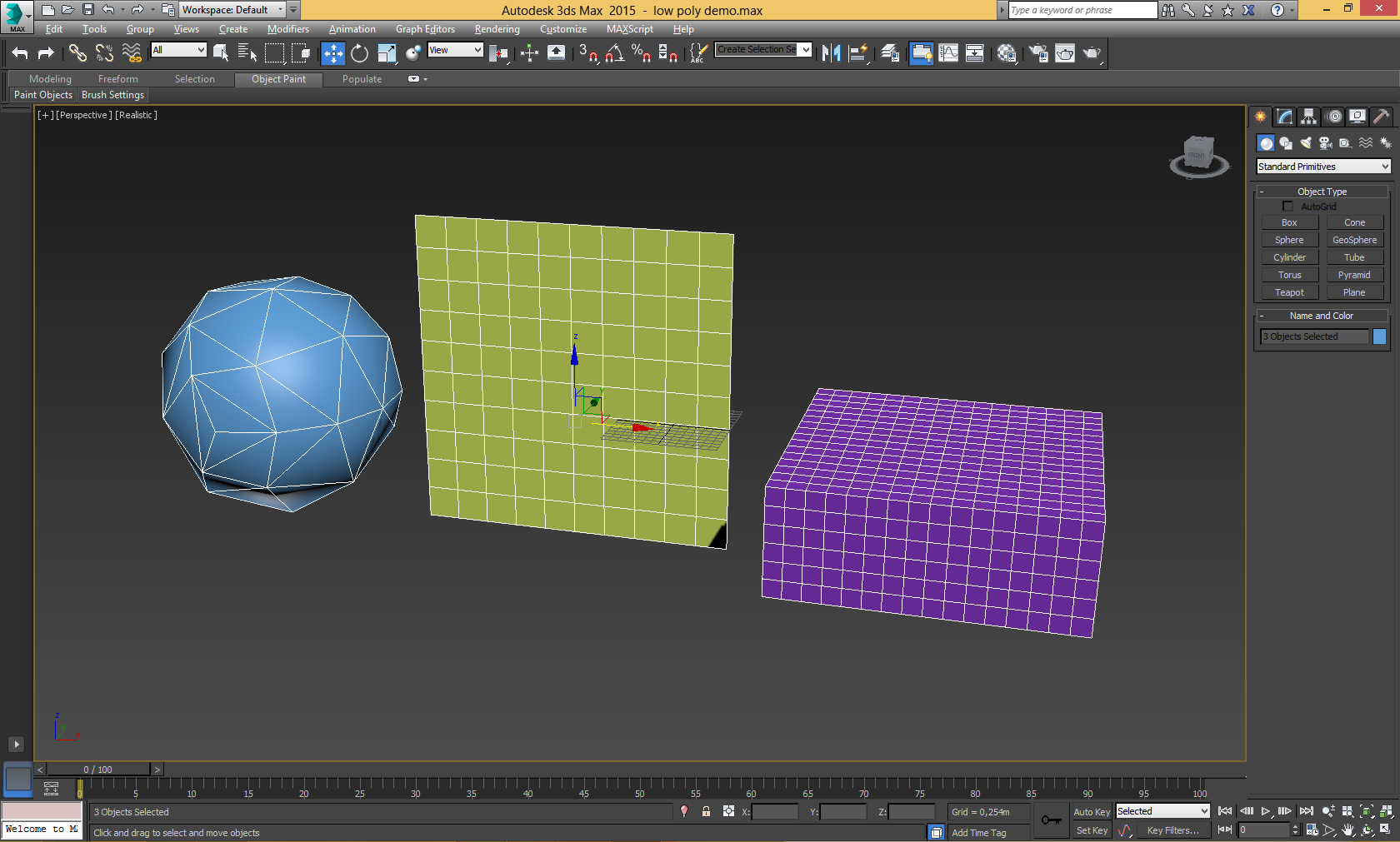
First, I created a geosphere, a plane, and a box, to become a cloud, a scene background, and some terrain for the foreground.

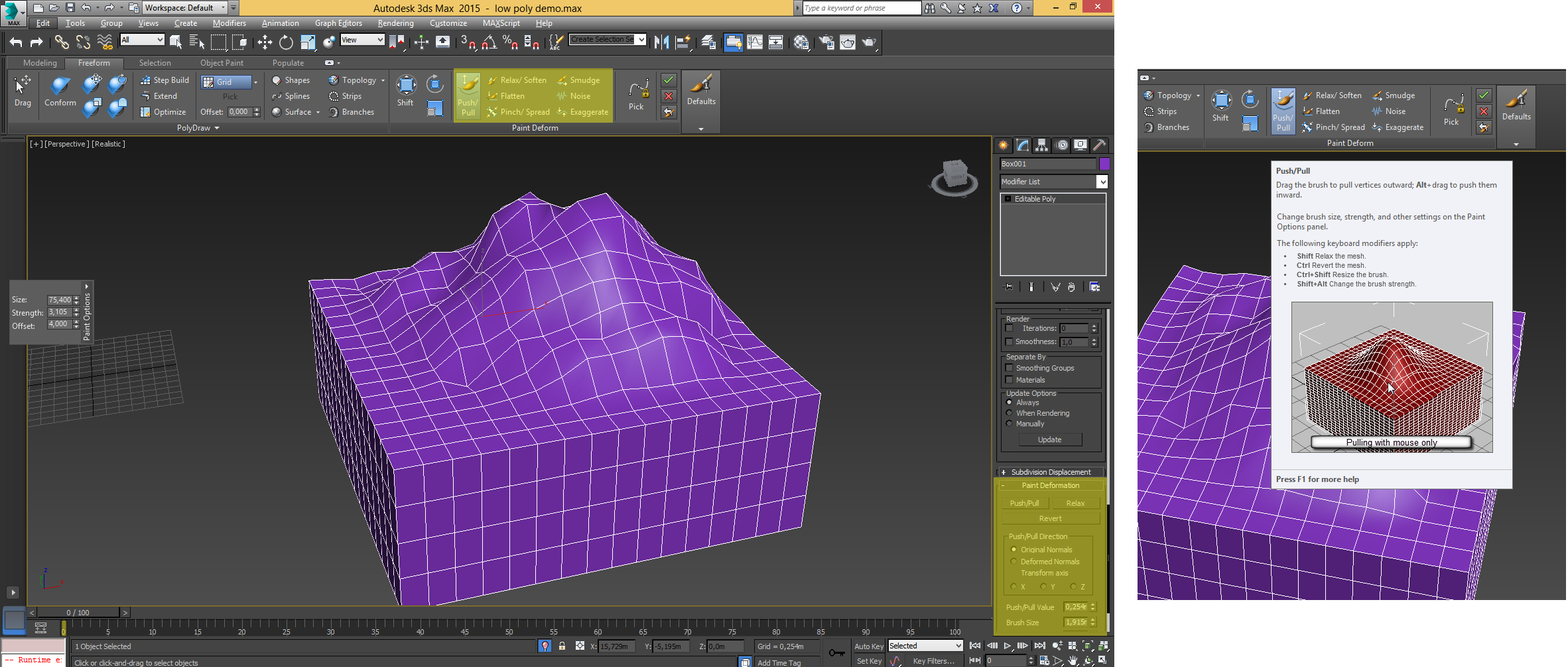
Before continuing, I am going to model some mountains in the box. For that, I convert the box to editable poly, and I’m going to use the paint deformation modifier. If you use the toolbar, you can hover the mouse on the button to watch a brief tutorial of this modifier. Play a bit, and when you are happy with the result, let’s move to the next steps.

In the low poly style, triangles look much better than quads. We can have triangles from our meshes by converting the models to editable polies, selecting all the vertexes, and connecting them. This is not necessary with the geosphere.

In order to make my life easier, I am going to create materials and assign them to the elements. We do not need to get into details, since we are going to edit the materials in Unity later. Just remember to check the option faceted in the material editor, give them a proper name, and select “Facets” in the viewport as a render system. In the case of the ground, I selected some faces and assigned them a different material. This is important so I can assign two materials to the object later in Unity.
It is time now to add the wrinkled paper effect. For that, I am going to apply the noise modifier. I like to use Fractal, with Roughness near to 1 for smaller models, and 0 for bigger models. Not all models require the same Strength in all axis.

After that, you should use Optimize to clean up the model a bit. This modifier removes vertices and edges that are not very visible in the model, so it is a welcome optimization. Have in mind that, to get the wrinkled effect, we often are making models with more vertices that we normally need for that model (so, low poly? Not so much!). You can also manually remove vertexes and edges that won’t be visible. Select them, hold control and click on Remove; you won’t remove any faces while removing the formers when you hold the control key down.
Now, to Unity!
Create a new scene and import the model. The first thing that you will notice is that the faces don’t look sharp as we expected, but softened. That happens because in Unity, this does not depend on the material, but on a property of the model. Select the model in the Project view, and change the Normals to Calculate, and Smoothing angle to 0. Click Apply and see the difference.

Now, use your artistic sense to compose a scene with the elements you’ve built during this tutorial. For this kind of scenes, orthographic cameras are normal, but I use to obtain nice results with perspective cameras as well. It really depends on the look you want to achieve. Remember, if it is the case, to mark the objects as “static”.

Now, we need to work in the materials. Since I named and assigned materials before in 3DS Max, I only need to make some tweaks. For this low poly style, we want pastel tones, with no brightness. Go to the material editor and lower the smoothness value to almost zero, and play a bit with metallic and the albedo colors. While at it, I thought I would paint the background blue. Let’s see how this playschool idea pays off.
After this, I’m adding some camera effect (color correction curves, screen space ambient occlusion, vignette and chromatic aberration), to get the final result.
The composition might not be the best, and the model is not the one I feel more proud about, but I hope that this post will serve to illustrate the process.
